Multi-Device Complementary View Adaptation with Liquid Media Queries
Andrea Gallidabino* and Cesare Pautasso
Software Institute, Faculty of Informatics, Università della Svizzera italiana, Lugano, Switzerland
E-mail: andrea.gallidabino@usi.ch; c.pautasso@ieee.org
*Corresponding Author
Received 6 November 2019; Accepted 13 November 2019; Publication 22 January 2020
Abstract
Responsive Web applications assume that they run on a single device at a time. Developers use CSS3 media queries to declare how the Web application user interface adapts to specific capabilities (e.g., screen size or resolution) of individual devices. As users own and use multiple devices across which they attempt to run the same Web application at the same time, we propose to extend CSS media queries so that developers can also use them to dynamically adapt so-called liquid Web applications as they are seamlessly deployed across multiple devices. In this paper we present the concept of liquid media queries. They support features to detect the number of connected devices, the number of users running the application, or the role played by each device during the application execution. The liquid media query types and features defined in this paper are designed for component-based Web applications, and they enable developers to control the deployment and dynamic migration and cloning of individual Web components across multiple browsers. Furthermore we present the design of how liquid media queries are implemented within the Liquid.js for Polymer framework and the corresponding distributed adaptation algorithms. We discuss the implications of multi-device adaptation from the perspective of the developers and also the users of a liquid Web application. Finally we showcase the expressiveness of the liquid media queries to support real-world examples and evaluate the algorithmic complexity of our approach.
Keywords: Liquid software, CSS media queries, multi-device adaptation, responsive user interface, complementary view adaptation.
1 Introduction
Liquid software [20] is a metaphor [28] that associates the shape and behavior of liquids with software: as a liquid is able to flow into and adapt its shape to its container, liquid software is able to flow across and adapt itself to fit across all the devices it is deployed on. Liquid software allows to seamlessly migrate parts of a running application (e.g., individual components of the user interface) or the whole application from a device to another. Liquid applications are responsive (e.g., they are able to adapt to the specific device running it [18]), but more importantly they are also able to adapt to the set of devices simultaneously running the application. Finally liquid applications can share their state across multiple devices while keeping it synchronized [24].
Nowadays, due to the improvement of Web technologies with the release of new Web standards (e.g. supporting full-duplex, direct communication between clients), we are witnessing the shift towards more complex and decentralized Web architectures [6], which in turn enable developers to create Web applications featuring support for improved liquid user experiences.
In our previous works we showed how we designed liquid abstractions for the data and logic layers in liquid Web architectures [10]. In this paper we focus on the user interface layer as we discuss in detail liquid media queries, an extension to standard CSS3 media queries [5] that allows the developers to create their own CSS style sheets that get activated when their Web applications are deployed across multiple devices. While as part of the liquid user experience, end users can control which user interface components are deployed on each device (e.g., by swiping or drag and drop), developers can use liquid media queries to declaratively describe how their applications can automatically react to changes in the execution environment. The concept was originally proposed in [8]. In this paper we give a complete presentation of liquid media features and types with examples, discuss in more detail the decentralized adaptation and deployment algorithm, as well as introduce a debugger tool for liquid styles.
The developers of liquid applications should be able to offer to the users an automatic rule-based deployment mechanism for populating all of the users’ devices with pieces of the application they are running, because a misuse of the manual liquid user experience may lead to non-intuitive deployments which contradict with the developer expectations and intent. For example, in the case of a picture sharing application, it should be possible to constrain the component in charge of taking and selecting pictures to smartphones, while the picture viewer component is deployed on a device with a larger display. This way, users can select which picture to display from their personal smartphone photo library and take advantage of a public device to have a shared slideshow.
The rest of this paper is structured as follows. After reviewing related work in Section 2, we present the design of liquid media queries in Section 3 and show how they are encoded within the Liquid.js for Polymer [7] framework (Section 4). The presented queries drive the algorithms outlined in Section 4.3, which are used to automatically adapt a distributed user interface across multiple devices [19] – as shown in the example scenarios of Section 5 – making it possible to shift from the traditional responsive UI adaptation [18], to a complementary one [21] able to automatically migrate Web components across the set of heterogeneous devices running a liquid Web application simultaneously. In the following sections, we discuss the multi-device adaptation by taking into consideration the impact of the adaptation from the perspective of both the users and developers of a liquid Web application (Section 6). In Section 7 and in Section 8 we present our conclusion and future work.
2 Related Work
In the literature we can find several research topics concerning adaptive multi-device user interfaces [25], such as Distributed User Interfaces (DUI) [17] or Cross-Device Interfaces [23]. All deal with distributed component-based user interfaces deployed across multiple devices [4]. User interface elements can be distributed across the devices either synchronously or asynchronously: when we talk about asynchronous distribution, the devices do not need to be connected in parallel when the UI elements are moved, while for synchronous distribution the devices need to be simultaneously connected [4].
In this paper we deal only with synchronous distribution, and design the automatic complementary view adaptation for the components of liquid web applications. In our scenario multiple devices are used together to accomplish a common task using the same Web application, however each device may play a different role and thus display different and complementary visual components. If the set of connected devices changes, then the distributed user interface should flow and adapt accordingly to the new execution device configuration [16].
There have been several attempts to use rule-based approaches to describe cross-device user interfaces [3]. Most rely on a centralised computation to determine where to place the components. Zorrilla et al. [29] propose to assign properties both to components and devices. The centralized server uses these properties to score the best targets for the distribution, and then shows and hides the corresponding components depending on which devices they are deployed on. The liquid media queries we present in this paper can also be seen as a rule-based approach, and we use the definition of the extended media queries in order to assign a score to the devices that can be a target for the distribution. However, the implementation of our algorithm is meant to be decentralized and considers every device connected to the application, not only the devices with assigned properties.
Husmann et al. [12] implement cross-device user interfaces in a decentralized environment and define a similar rule-based approach. They do not associate the rules to CSS media queries, nor they support multiple CSS style sheets that need to be enabled or disabled on the target devices. Their approach deploys the whole application on all connected devices and then hides the components that should not be displayed. Our approach is more fine-grained as it moves across the devices only the components that need to be deployed, migrating them directly from the device they are currently running on, instead of deploying the entire application from a centralized server.
3 Liquid Media Types and Features
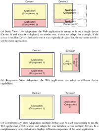
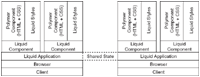
Choosing the appearance of a Web application and deciding how it should dynamically adapt to the devices it is deployed on, is a mandatory task during the design of a Web2.0 application [26]. Responsive design is the commonly followed best practice used to create user interfaces able to adapt to the devices’ specifications [18]. Responsive design requires developers to decide how the UI is presented to the user and how it changes when deployed on different devices with distinct input/output capabilities. The challenge of responsive Web design is to be able to adapt any Web application to any kind of Web-enabled device, ranging from small and weak smart objects, to the largest and more powerful computers connected to big screens [14]. While in the past designing responsive Web applications was difficult, nowadays we can easily design responsive Web applications with CSS3 and HTML5, which are the current standard used for creating responsive Web user interfaces. Nevertheless, following the birth and evolution of the Internet of Things during the last decade [2], developers face new challenges that responsive Web design cannot solve on its own. Responsive UIs are meant to adapt to a single device at the time, however, as the number of devices owned by a user increases [11], developers need to develop Web applications which can adapt their user interface taking into account the whole set of multiple, heterogeneous connected devices (see Figure 1).
In particular, the goal is to allow developers to create their own complementary view adaptations, in which the users can take advantage of all their simultaneously connected devices. A complex user interface can be scattered and presented on multiple devices, in such a way that its users can have immediate access to more information in comparison to single-device usage scenarios [1]. In fact, with the design of a complementary view, we have the opportunity to exploit companion devices and use them to extend the screen size to display parts of the UI of an application which would not normally fit the visible area of a single screen.
The multi-device adaptation needed for creating complementary views can be decomposed in three essential sub-tasks:
- Adapt styles in a single device deployment: Whenever the whole application or a single component is deployed on a device, its user interface needs to adapt. The appearance of the deployed software changes because of the device hardware specifications (e.g., the screen size), or because the user can interact with the application using different kind of interactions more suitable to the device hardware (e.g., swiping on a smartphone). Consequently some functionalities can be enabled or disabled depending on the device capabilities (e.g., geolocation on location-aware devices). Considering nowadays Web applications, the single device adaptation is already possible with the help of standard HTML5 and CSS3 [5].
CSS3 media types and features can be used to adapt the user interface of an application to multiple devices by associating a CSS style sheet with some expected device characteristics. Standard media features consider qualities of the Web browser and its environment (e.g., the screen size and resolution, the output media, and the device orientation). If the media query matches what the device supports, then the corresponding style sheet is activated.
Standard CSS3 media queries are at the foundation of responsive user interfaces that adapt to a single device at the time.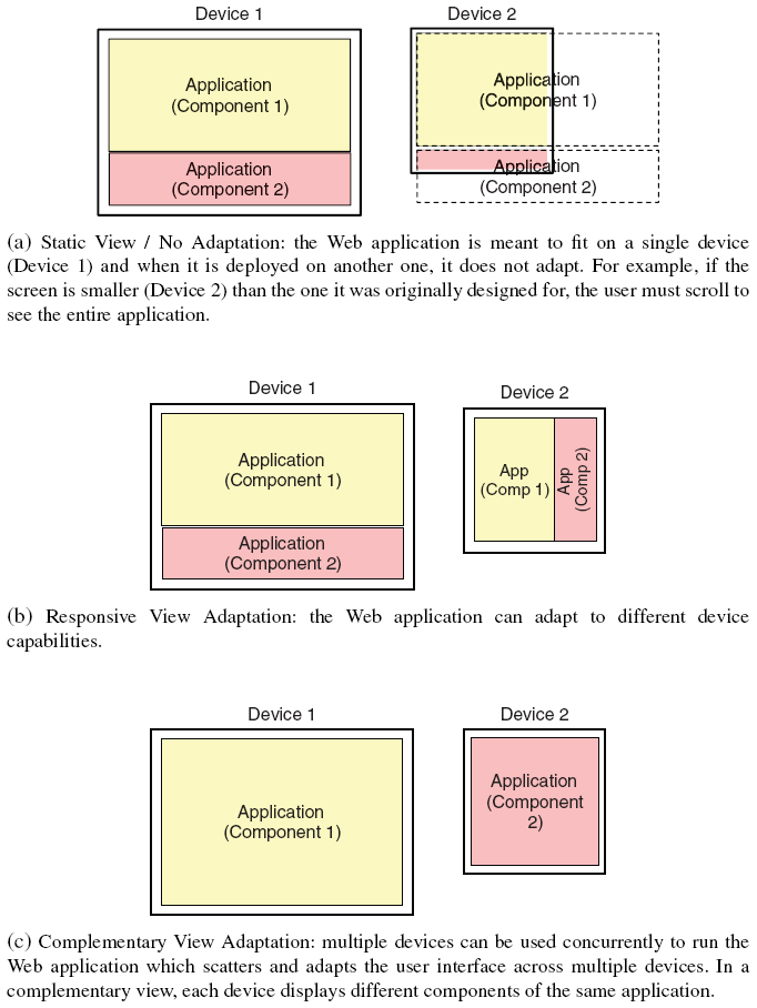
Figure 1 View adaptation options: (a) no adaptation with static definition of the appearance of the Web page; (b) responsive view adaptation; (c) complementary view adaptation.
- Adapt styles in a multi-device deployment: The latest CSS3 standard lacks sufficient expressiveness to describe the user interface adaptation in a multi-device environment. CSS does not yet define media types and features that can be used to describe a multi-device deployment, therefore we cannot use it to describe multi-device views that can change styles whenever the user is using multiple devices simultaneously (e.g. react when the user connects a new device, or disconnects a previously connected device). Nevertheless, CSS3 is a well-rooted tool in the Web and we believe that its expressiveness for single device adaptations is very powerful, therefore we decided to extend it. As we are going to show in the next section, the concepts of style sheets, media features and media types can be used also for adapting the UI of an application to multi-device deployments and in Subsection 3.1 we define our own liquid media features and types.
With the definition of new CSS3 media types and features we can dynamically change the styles of an application at runtime and react in real time to any change of the set of connected devices. - Migrate components of an application between devices: Since our goal is to build fine-grained complementary view adaptations, we must be able to deploy and migrate pieces of an application among the set of devices. To do so, we need to define policies that can check the current deployment and decide whether the components need to be migrated every time the set of connected devices changes. The actual migration mechanisms and liquid primitives are provided by the Liquid.js framework API [7].
3.1 Automatic Component Style Adaptation
In order to implement the multi-device adaptation, first the application must be aware of when it is deployed on multiple devices. Additionally, it should react when the deployment configuration changes. Since standard CSS3 media queries do not define media types and features that can be used to define multi-device deployment, in this Section we introduce and describe new media types and features suitable for liquid web applications (Table 1). They can be used by the developers to define cross-device user interface adaptations by declaratively constraining on which devices the components should be deployed on, and by controlling which style sheets should be enabled depending on individual properties of the set of devices connected to the application.
Table 1 Proposed media types and features for liquid media queries
| Name | Description |
|---|---|
| Features | |
liquid |
Shortcut for min-liquid-devices: 2. |
liquid-devices |
The number of connected devices. |
liquid-users |
The number of connected users. |
liquid-device-ownership |
Whether the device is private, shared or public. |
liquid-device-role |
The application-specific role of a device. |
| Types | |
liquid-device-type |
The type of device(s) running the application. |
We define the following liquid media features and types (see Table 1):
Liquid and liquid-devices – In parallel screening scenarios [10] liquid applications are deployed on multiple devices in parallel. Detecting whether the liquid application is currently running on multiple devices is therefore required for the adaptation. The liquid feature refers to any deployment with at least two connected devices, while the liquid-devices feature makes it possible to create different views for specific numbers of connected devices. Similarly to CSS3 media queries, it is also possible to define the minimum and maximum values for the liquid-devices feature by setting the values for min-liquid-devices and max-liquid-devices (e.g., min-liquid-devices:3 can be used to dynamically change the view of the liquid application when there are at least three connected devices).
Liquid-users – In multi-user parallel scenarios [10] the liquid application is deployed across multiple devices and multiple users can interact with it at the same time. The liquid-users media feature allows to adapt a user interface depending on the number of users connected to the application. The features min-liquid-users and max-liquid-users can also be used for creating styles for single user applications (e.g., max-liquid-users: 1) and for multi-user applications (e.g., min-liquid-users: 2).
Liquid-device-ownership – The types of access granted to the devices can be either private, shared, or public. A private device is owned and used exclusively by one single user. Shared devices are owned by one user, but they can be used by another. Public devices (e.g., public displays [22]) can be used by both registered and authenticated users or by anonymous guests.
Liquid-device-role – The device role is used to classify devices according to application domain-specific features. Developers can declare which roles they expect the devices used to deploy their application should play (e.g., controller, console, or multimedia display). Users can assign one of the predefined roles to their actual devices. To do so, the device-role property can be used to assign styles to be activated on devices with the assigned role. When the developers decide to use the liquid-device-role feature, the connected devices must be configured at runtime and a role must be assigned to them. The role metadata associated with the device can change at any time.
Liquid-device-type – The latest standard CSS3 media types only distinguish between screen, print, and speech devices. Depending on the context of the application, it can be useful to have a more fine-grained distinction the types of screen devices connected, so that they can be assigned to perform certain kind of tasks (e.g., desktop computers are used more for working in an office) [15], while other devices are more convenient in certain social situations (e.g., smartphones as opposed to laptops are more convenient during meals) [13]. In our current implementation liquid-device-type can be set to Desktop, Laptop, Tablet, Phone.
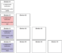
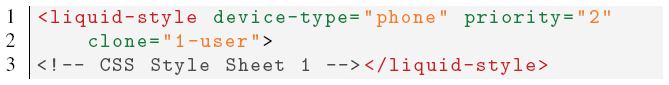
Listing 3.1 shows an example of the definition of a Web component which defines multiple liquid media queries. The component named component-example contains a style tag with two CSS3 media queries. These queries both use the liquid-device-type and min-liquid-devices features we have previously defined:
Listing 3.1 Component defining a style containing two liquid media queries
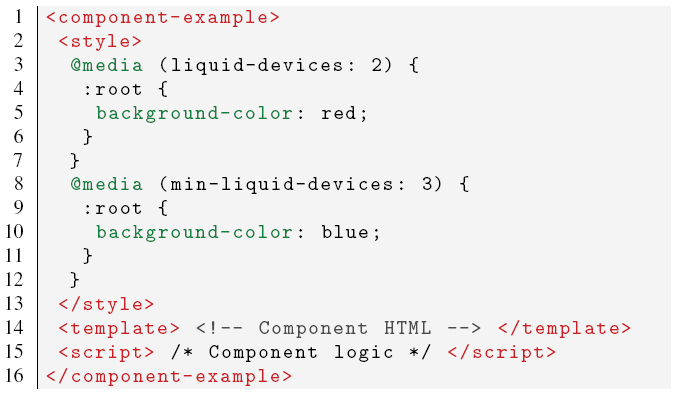
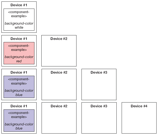
Figure 2 Style adaptation of the component described in Listing 3.1 when up to four devices are connected to the application.
- The first liquid media query liquid-devices:2 activates the style it encapsulates only when the set of connected devices consist of exactly two devices. Whenever there are two connected devices, the background color of the component is changed to red;
- The second liquid media query min-liquid-devices:3 reacts whenever there are three or more devices connected. As soon as a third device connects, the background color of the component is changed to blue, if more devices connect the color does not further change and remains blue (see Figure 2).
3.2 Component Deployment Redistribution
In the previous section we introduced the media features and types that are needed to describe the multi-device environment, in this section we describe the policies that can be used to control the placement of components among the set of connected devices. It is important to note that the deployment is not static, since the environment can change (e.g., devices can connect and disconnect while the liquid Web application is running). Whenever there is a change in the set of connected devices, a new deployment configuration is computed and the components are migrated across the devices accordingly.
Different policies can be used to decide where components will be migrated and the decision on how the components are redistributed across the devices is left to the developers of the Web application. The developer can choose the policy of the redistribution considering the following two different assumptions:
- Redistribution only: The application does not create new instances of a component during the redistribution, meaning that the number of instantiated components of the UI of the application remains constant.
- Redistribution and cloning: The redistribution of the UI allows to spawn new clones of existing components. In this case a given component can have additional instances spawned on suitable devices. When such devices disconnect, the cloned components are not migrated to other still connected devices, unless it was the last instance in the set of devices.
The choice between the two assumptions is application specific and depends on how the developers expect the application to be used. The redistribution only assumption is more suitable for single-user applications running on a limited selection of devices, while cloning can be used for multi-user applications in which a certain component should be displayed on multiple screens, e.g. on each device of a specific type or on some device of each distinct user.
3.2.1 Redistribution step
How can developers control the target devices on which components should be deployed on? Developers can use the liquid media features and types we described earlier. Whenever the developers define a liquid media query inside a component, the application assumes that the developers are hinting that the component should be deployed on a device with matching features and types, if it is already available in the set of connected devices, or migrated on such device if it becomes available while the application is running.
The decision on how to redistribute the components can be based on the following policies:
- Exact match: This policy decides to move a component to any device that matches all the constraints defined by all the liquid media queries defined in the component. If there is no such device, then the migration does not occur.
- Maximize device-component constraint affinity: Each component can define multiple liquid media queries and it is possible that the developer chooses to create alternative media queries that cannot be accepted at the same time (e.g., in the example presented in Listing 3.1, it is impossible that both liquid media queries can be matched, because they have exclusive values). The reason for the developers to design such liquid media queries is for adapting the same component to alternative deployment configurations. When the component media queries target different devices, it would be possible to migrate the component to any of those devices if they are available. If more than one such device is available, this policy migrates the component to the device that matches the most liquid media queries defined in the component, instead of migrating it only when all queries are exactly matched.
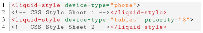
- Priority-based: The priority-based policy can control which device becomes the target of a migration when multiple devices match the same liquid media query. With this approach the developers associate a priority score to their liquid media queries. This policy moves the components to the device that accepts at least one liquid media query defined in the component, and in case there are more devices that accept the same query, then the component is moved to the one that has the highest priority. Listing 3.2 shows how the developers can define the priority of a liquid media query by giving a value to the newly introduced
priorityfeature. In the example, the first liquid media query defines a style that should be activated with higher priority in respect to the second liquid media query. Figure 3 shows how the component defined in Listing 3.2 is moved to different devices when new targets become available. The component is initially deployed on a laptop, if a new phone or tablet connects, since the component defines at least one matching liquid media query, it migrates to either one of them and changes the background color accordingly. When both phone and tablet connect, then the component is moved to the phone and the background color is set to blue, because the priority defined in the liquid media query that matches the phone is higher than the one of the tablet. - Minimum number of components per device: All the policies explained before do not always take full advantage of all connected devices, because multiple components can be migrated to a single device matching multiple liquid media queries, instead of scattering them among all available devices. This policy is primarily meant to work in conjunction with the previous policies as it always tries to instantiate at least one component per device, if there are enough components to be scattered in the set of connected devices.
Listing 3.2 Liquid media query including the priority feature.
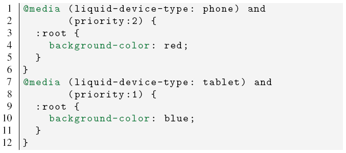
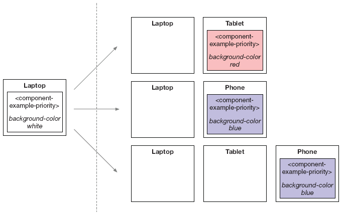
Figure 3 Redistribution of the component described in Listing 3.2 when it is initially deployed on a laptop and then new devices connect.
- Minimize migration cost: If the set of devices changes often, it is possible that the redistribution moves many components around in a short amount of time. The result is that components may flicker between devices and thus hinder the usability of the liquid application. This policy minimizes the number of migrations when there is a change in the set of connected devices by ensuring the stability of the configuration (e.g., components are only migrated if the device on which they are running on is disconnected or if more suitable devices are connected, but are not shuffled between existing devices). Developers can also configure the policy to specify an upper limit to the number of migrations that can be performed during each adaptation.
The redistribution step deals with three possible outcomes and some of the policies we presented are more suited than others depending on the scenario:
- #components < #devices: When there are more devices than components, some of the devices will not be selected as targets of the migration. In this scenario the exact match policy is useful to select the best device to deploy the components given a huge selection of different devices. Together with the minimum number of components per device policy, the redistribution can target the best subset of devices desired by the developers.
- #components > #devices: In this scenario the component instances outnumber the devices, therefore multiple components are co-located on the same device. The maximize device-component affinity and the priority-based policies can be used to select the best configuration of devices for running the application when a small selection of devices is available. Again the minimum number of components per device policy can be used to avoid that the application is deployed on a single device when there are no matching devices available.
- #components == #devices: In this scenario the minimum number of components per device policy will instantiate a component on each device, taking full advantage of the set of connected devices. Given the small selection of devices, the priority-based policy is well suited for this scenario, since the components with the highest priority value are selected to be moved to the best matching devices first. In this specific scenario, when the developers choose to use the minimum number of components per device policy and the set of devices changes, it is possible that the redistribution completely changes the deployment of the application, which is not good in terms of user usability. In this case the minimize migration cost policy can be used.
3.2.2 Cloning step
The cloning step is independent from the redistribution process and it happens after the redistribution ends.
When multiple instances of the same component need to be deployed on multiple devices, developers must define an additional feature labeled clone within the liquid media queries. The clone feature enables multiple instances of the source component to be cloned across multiple devices instead of just migrating it on one of them.
In Listing 3.3 we show a liquid media query that defines the clone feature. In this particular case the component will be instantiated on all connected phone devices.
The clone feature accepts values in the form of N – feature, where N is a positive non-zero integer or the symbol *, and feature ∈ {user, device, phone, tablet, desktop, laptop, shared, public, private, role = X}. The value N specifies the maximum number of instances of the source component which should be cloned across the set of available devices which match the liquid media query constraints in relation to the chosen feature. Their combination allows to write cloning rules such as:
1-user, the component is cloned once per user, picking any of their available devices;
1-device, the component is cloned at most once per device type;
2-tablet, up to two component instances are cloned among all available tablets;
*-public, the component is cloned once on each available public devices.
*-role=dashboard, the component is cloned once on each devices playing the dashboard role;
Listing 3.3 Liquid media query including the clone feature
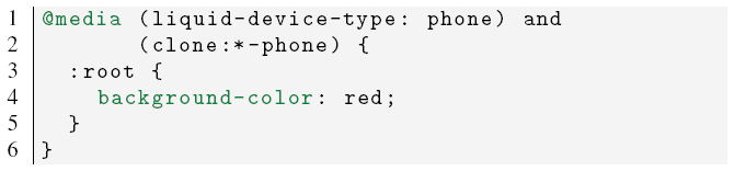
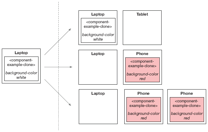
Figure 4 Redistribution and cloning of the component described in Listing 3.3 when it is initially deployed on a laptop and then new devices connect.
The clone feature works in conjunction with the other features and types of the liquid media queries, therefore a device matches the cloning feature only if it also matches the whole liquid media query.
In Figure 4 we show how the redistribution and cloning of the component described in Listing 3.3 happens. The component is initially deployed on a laptop and is not migrated nor cloned when the tablet connects, because the liquid media query does not match with the tablet. When a phone connects, then the component is migrated and if additional phones connect, then the component is cloned on those devices.
4 Design and Implementation
4.1 Liquid Style Polymer Component
Standard CSS3 media queries do not allow developers to define new types, features, nor they support customizing existing ones.1 The solution we designed for extending the standard media queries is to create a new Web component called liquid-style built on top of the Liquid.js for Polymer framework [7].
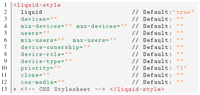
Listing 4.1 Liquid-style element and all available attributes.
Listing 4.2 Liquid media query expression mapped to the corresponding liquid-style attributes.
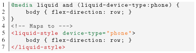
The liquid-style element shown in Listing 4.1 allows developers to write their own liquid media queries and encapsulate a standard CSS style sheet that is activated when the media query expression is accepted by the device. The liquid-style component allows developers to assign values to its attributes (e.g., device-role) that can be mapped to the previously defined liquid media types and features by adding the liquid- prefix (e.g., liquid-device-role). Developers can define their own liquid media queries by assigning values to the corresponding attributes, as shown in Listings 4.2 and 4.3.
In the first example, the liquid media query expression contains both the liquid feature and the liquid-device-type. Inside the liquid-style component it is not necessary to explicitly set the liquid attribute to true, since it is the default value for the liquid-style element. The liquid-device-type value is mapped to the device-type attribute.
Listing 4.3 Liquid media query expression including standard CSS media features mapped to the corresponding liquid-style attributes.
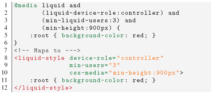
The second media query expression contains the liquid media features liquid-device-role and min-liquid-users, which map directly to the device-role and min-users attributes. Furthermore the expression also defines the standard CSS3 media feature min-height, which in the liquid-style element must be written into the css-media attribute.
4.2 Liquid Style Design
The automatic complementary view adaptation is achieved through the liquid media query expressions that both define when styles should be enabled on a device and constrain where the components should be migrated if any device with the appropriate features connects to the application. The liquid-style component is designed to be attached directly to a liquid-component [7] and bundled with a standard Polymer component. Our current implementation of the redistribution process follows both the priority-based and the minimum number of components per device policies (discussed in Subsection 3.2.1).
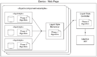
Thanks to Liquid.js for Polymer, developers can build their own component-based liquid Web application on top of any modern Web browser (e.g., Chrome, Firefox). The framework implements the two liquid user experience primitives [10] that are needed for the redistribution and cloning of the components. The migrate primitive allows components to be moved from a source device to another, while the clone primitive can be used to copy components and keep them synchronized across multiple devices. Furthermore Liquid.js transparently and automatically creates a synchronized shared state between all connected devices. The shared state contains all the information about the current deployment configuration, such as the number of users connected and the information linked to their set of devices, such as number, ownership, type, and role. The devices can synchronize this information by sending direct messages in a peer-to-peer mesh without requiring to rely messages through a Web server.
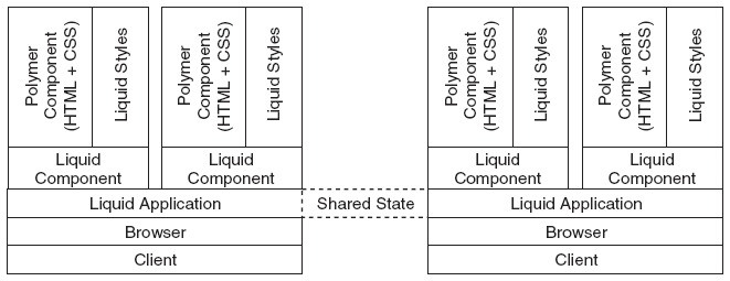
Figure 5 Architecture of an application built with Liquid.js for Polymer: the liquid style elements are bundled with the Polymer component inside each liquid component.
Figure 5 shows how the liquid components are built on top of the liquid application, meaning that each component has access to the Liquid.js API [7] and therefore has direct access to the liquid user experience primitives migrate and clone. Each liquid component can define multiple liquid styles and the framework automatically extracts the liquid media query expressions from within every instantiated component and shares them with all other connected devices, so that each device can check whether it would satisfy the liquid media queries or not. Whenever a query is accepted on a device, that device becomes a possible target for the migration of the corresponding component. When multiple devices become a possible target for the same liquid component, Liquid.js selects the target following the priority-based policy.
Since all the information of the connected devices is stored in the shared state of the clients, each device is able to compute new deployments and perform the migration and cloning of the components.
4.3 Liquid UI Redistribution and Cloning Algorithm
The UI adaptation algorithm operates on three distinct phases: constraint-checking and priority computation, redistribution and cloning, and local component adaptation. The algorithm first decides which devices are suitable for displaying a component encapsulating the liquid media queries, then it migrates and clones the component on the highest priority device and activates the corresponding style sheet as soon as the component is instantiated on the target device.
4.3.1 Phase 1: Constraint-Checking and Priority Computation
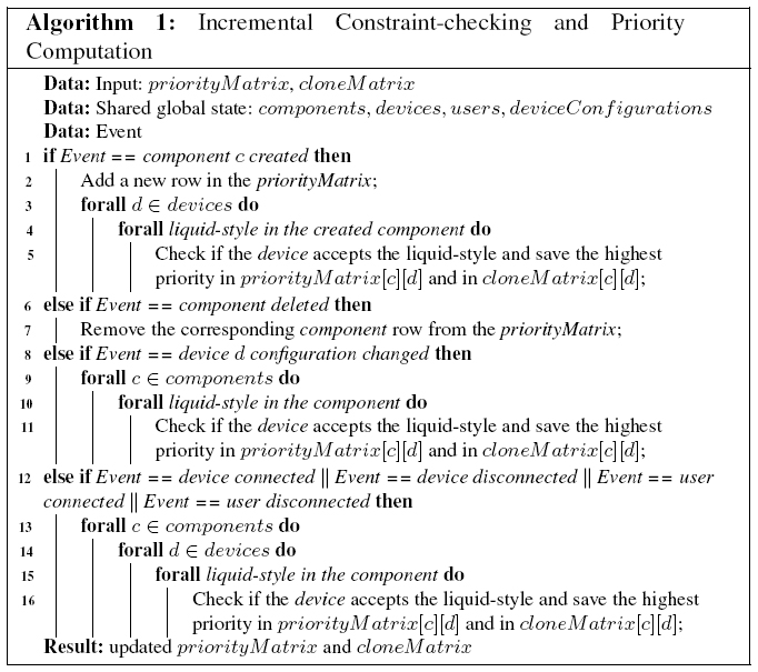
The constraint-checking phase decides if there is a suitable device in the pool of connected devices that satisfies the liquid media query expressions encapsulated inside the components.
Algorithm 1 computes the matrix of valid target devices in which at least one liquid media expression is accepted. The matrix has size #components × #devices. Each element represents with a positive integer the highest priority value of all the accepted liquid media queries encapsulated in the component, or zero if there are no accepted queries.
The matrix shown in (1) is the priorityMatrix produced by Algorithm 1 during the example scenario shown in Figure 10, when both UserA and UserB are connected. There are four instantiated components and seven devices connected to the application. cvideo’s liquid media queries (see Section 5) are accepted by device dlaptop, dtv. At least one query of priority 2 was accepted by device dlaptop and at least one query of priority 4 was accepted by devices dtv. dphone1 accepts at least one query encapsulated in components cvideoController, csuggestedVideo, the first one with priority 2 and the latter with priority 1.
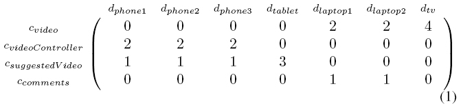
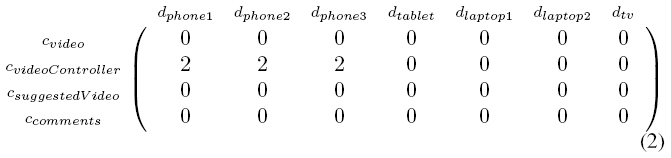
Algorithm 1 also computes the cloneMatrix shown in (2), which has a similar structure to the priorityMatrix, but stores only the information about the components that define at least one clone rule in the attributes of the liquid-style elements they encapsulate.
Liquid.js runs Algorithm 1 whenever one of the following events occurs:
- A component is created or deleted from a device: Creating or deleting a component does not affect the acceptance of the liquid media queries of any other components. When a new component is created (or removed), a row is added (or removed) to the priorityMatrix and the algorithm recomputes the highest priority scores. If a created component defines a liquid media query with the clone attribute, then the highest priority value between the clone styles is also stored in the cloneMatrix.
- The meta-configuration of a device is changed: When the device type, ownership, and role change, the priority values of the corresponding column are updated for both matrices.
- A device joins or leaves the current session: These events affect the devices, min-devices, and max-devices features of the liquid media queries, which triggers the recomputation of the whole priorityMatrix and cloneMatrix.
- A user connects or disconnects from the application: Changes to the users, min-users, and max-users features also require a complete recomputation of the priorityMatrix and cloneMatrix.
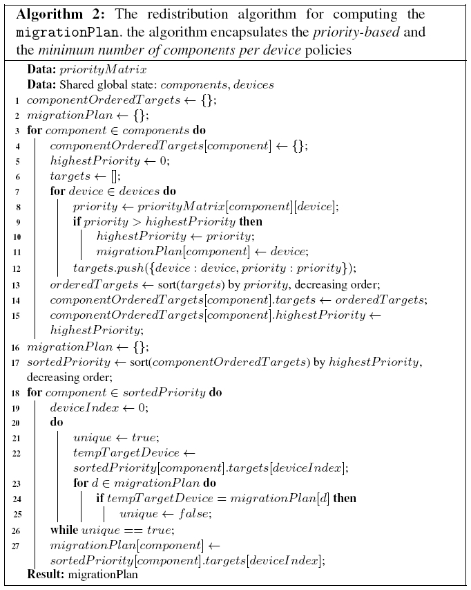
4.3.2 Phase 2: migration and cloning
The migration and cloning phase uses the previously computed priorityMatrix and cloneMatrix to determine on which devices each component should be migrated or cloned on. The algorithm prepares a migration plan where each component is assigned to a given target device. The choice follows the minimum number of components per device policy so that the number of components running on each device is minimized, making it possible to spread the liquid Web application across as many devices as possible. If the component instances outnumber the available devices, some of the components will be co-located on the same device. Equation (3) shows the resulting migrationPlan computed under the constraints of the liquid media queries of the scenario depicted in Figure 10 (see Section 5 for the constraints). cvideo is migrated to dtv with the highest priority, ccomments is migrated to dlaptop with the lowest. Once the migrationPlan is ready, Liquid.js redeploys the components across the set of devices accordingly.
| (3) |
After the migration step is complete, the cloning routine can start. This process exploits the cloneMatrix computed in phase 1 and the clone rules associated to the components that need to be cloned. All the devices that were not used in the previous migration step are flagged as candidates for running a cloned component. The candidates are grouped and prioritized following the clone rules, the device that contains the source component that needs to be cloned is never considered as a possible target of the cloning, and every component which can be cloned is associated with the list of target devices. Similarly to the previous step, the algorithm prepares a clone plan that is used by Liquid.js for cloning the components. Equation (4) shows the output clonePlan computed with the matrix shown in Equation (2) under the constraints of the liquid media queries of the scenario depicted in Figure 10 (see Section 5 for the constraints).
| (4) |
Algorithm 2 computes the migration plan by implementing the priority-based and minimum number of components per device policies. If multiple liquid media queries have the same priority and multiple components can be migrated to the same connected devices, the priority is resolved based on which component was instantiated first in the liquid application. However it is encouraged that the developers give different priorities to their liquid media queries, instead of relying on the time when components are instantiated. While it can be easy to predict when a component is instantiated on a single device environment, it is not trivial to determine beforehand when a component is instantiated if the application is deployed on multiple devices.
The first for-loop in the algorithm orders the priority scores for each component, then, starting from the one with the highest priority, it builds the migrationPlan. In this version of the algorithm, the outcome does not consider the overall migration cost in terms of the number of migrations to be performed or the time required to migrate a given component instance. Minimizing such cost would become important when the algorithm is applied to an input configuration of components already instantiated across multiple devices.
4.3.3 Phase 3: component adaptation
The component adaptation phase happens once the migration and cloning is complete. Each device checks for each instantiated component which liquid media queries are accepted and activates the associated style sheets. The standard CSS mechanisms for dealing with overlapping selectors take over.
4.4 Run-time complexity
The complexity of the algorithm we discussed in Subsection 4.3 depends on three factors: the number of devices (D), the number of the components (C), and the number liquid-style elements (S). In the worst case, the run-time complexity of Algorithm 1 is 𝒪(D ∗ C ∗ S). However, the actual run-time complexity depends on the event that triggered the incremental version of the algorithm:
- 𝒪(D ∗ S) for newly created components;
- 𝒪(C) for deleted components;
- 𝒪(C ∗ S) for changed device configurations;
- 𝒪(D ∗ C ∗ S) for all other events.
The run-time complexity of the migration and cloning phase is 𝒪(C∗D2), and the adaptation algorithm explained in Subsection 4.3.3 has complexity 𝒪(S).
The execution for Algorithm 1 can be parallelized as the responsibility for computing the priority Matrix columns can be offloaded on each device, assuming that they all have access to the component liquid style definitions. Each device takes care of updating their columns whenever an event occurs and stores the result in the application shared state, which is automatically synchronized among all devices.
4.5 Decentralized Algorithm
The algorithm we propose can run on a Web server, however our goal is to keep the computations of the liquid application closer to the devices of the users. The reason for our choice is twofold:
- We allow the liquid application to be adaptive even if the Web server goes offline;
- We enhance privacy because it is not necessary to store on the Web server any information about the users’ devices.
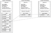
In Figure 6 we show the architecture we designed to decentralize the redistribution and cloning algorithm. We introduce two new components:
Liquid-stylecontroller: The controller is in charge to observe any change in the shared state. It interacts directly with the framework API and monitors all events occurring in the set of connected devices (e.g., it monitors for new connected devices). When an event is triggered, it propagates the event to all liquid components that load theliquid-stylebehavior.Liquid-stylebehavior: The behavior2 gathers information from all instantiatedliquid-stylesand broadcasts messages received from the controller to theliquid-styles. Newliquid-stylesregister to the behavior as soon as they are instantiated. The instantiatedliquid-stylescan enable and disable styles properly only if the behavior is loaded inside the liquid component.
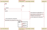
In Figure 7 we show how the controller, the behavior and the liquid-styles interact during initialization. Immediately after the liquid component is loaded, the behavior starts running and awaits for the registration of new liquid-styles. Once all the liquid-styles are loaded, the behavior notifies the controller that the liquid component is ready. The controller immediately creates a new row in the priorityMatrix and cloneMatrix in the shared state, and then subscribes to it. The Liquid.js framework automatically and transparently synchronize the state without blocking any device. After the subscription, the controller retrieves the last version of the deployment configuration and pushes it into the behavior. The behavior notifies all liquid-styles which then will check if there is a match between the liquid media queries and the current deployment configuration. If there is a match, the style it encapsulates is enabled, otherwise it is disabled. Once all components in a liquid Web application are loaded, it is possible to compute the redistribution and cloning of the deployment.
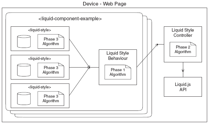
Figure 6 Component view of the liquid-style component and how it is connected to the liquid-style behavior and controller. The phase 1 algorithm (see Subsection 4.3.1) is encapsulated inside the liquid-style behavior; the phase 2 algorithm (see Subsection 4.3.2) is encapsulated inside the liquid-style controller, and the liquid-style component is in charge of running the phase 3 algorithm (see Subsection 4.3.3).
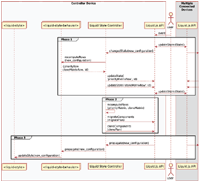
The decentralized execution of the algorithm is shown in Figure 8 and is initially triggered by the actions of the user, e.g., the user connects with a new device, or changes a device role. When the deployment configuration is changed, the Liquid.js framework catches the event and updates the shared state between the devices accordingly. Once the synchronization finishes all connected devices react and propagate the new deployment configuration to the liquid-style controllers. The controllers then send the new configuration to all liquid-style behaviors which previously registered to them. The behaviors recompute the priorityMatrix and cloneMatrix. The phase 1 algorithm described in Subsection 4.3.1 is ran by the behavior, but instead of computing the whole priorityMatrix and cloneMatrix as we previously presented, the behavior computes only the rows associated to their own liquid component. The rows of the two matrices are then sent back to the controller which takes care of updating the shared state.
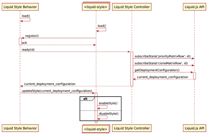
Figure 7 Sequence diagram of the initialization of the liquid-styles, liquid-style behavior, and liquid-style controller.
Phase 2 starts when all the rows in the matrices are updated. In order to prevent that multiple devices redistribute the same components multiple times, we need to run the algorithm described in Subsection 4.3.2 one single time. The most powerful device is selected by the Liquid.js framework [9] and it computes both the migrationPlan and the clonePlan inside the controller component. The controller then starts the redistribution and cloning phase by calling the corresponding liquid user experience primitives in the Liquid.js API.
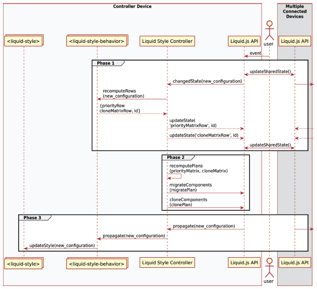
Figure 8 Decentralized algorithm processing.
Finally phase 3 starts when the components are migrated and cloned. The API propagates to the controller all events triggered by the migration, which are then furthermore propagated to the behaviors. The behaviors broadcast the new deployment configuration to all liquid-styles, which then run the phase 3 algorithm described in Subsection 4.3.3.
5 Liquid UI Adaptation Example
We show the expressiveness of liquid media queries by designing the liquid-style components on a realistic multi-device video player application.
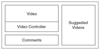
The video player is built with four components (see Figure 9):
- The video component which displays and plays the video;
- The video controller component which allows the user to play/pause and seek to a specific time in the selected video;
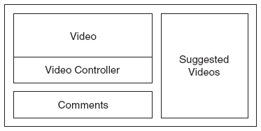
Figure 9 Liquid video player user interface split into four components: video, video controller, suggested videos, comments.
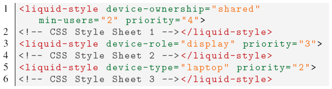
Listing 5.1 The liquid-style elements defined for the video component.
Listing 5.2 The liquid-style element defined for the comments component.

- The suggested videos component that displays a list of recommended videos, which can be selected to be played;
- The comments component where the user can read or post comments about the video.
These components can be deployed across different devices (phones, tablets, laptops, and televisions) owned by one or multiple users.
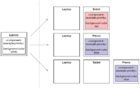
It is best to display the video component (see Listing 5.1) on the devices with big screens, for this reason we define three liquid media query expressions including the attributes device-type: laptop, device-role: display, and device-ownership: shared with different priorities. The rule for device-type: laptop has an higher priority over the rule defined for the comments component (see Listing 5.2) so that whenever a laptop device is available, the video component is migrated to the laptop. If the user configures the role of any device and assigns the role display to it, then this device will have priority over the laptop. Finally, if there are multiple users connected to the application (attribute min-users:2), the priority for deploying the video component is given to shared devices (e.g., a television).
Listing 5.3 The liquid-style element defined for the video controller component.
Listing 5.4 The liquid-style elements defined for the suggested videos component.
The video controller component (see Listing 5.3) defines a liquid media query expression with the attribute clone:1-user. The clone rule migrates the component to a phone owned by a user, then it clones the component for every other user, if they connect at least another phone to the application.
The suggested video component (see Listing 5.4) defines two styles: one for tablets and the other for phones. The tablet style has an higher priority with respect to the phone style.
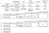
5.1 Scenario 1: Second User Connects a Phone
In Figure 10 we show the component redistribution for a set of devices before and after a second user connects to the application. The initial configuration with only devices owned by UserA is obtained following the priorities associated with the liquid-style elements of each component. Starting from the suggested video component, which migrates to the tablet, then the video component migrates to a laptop device, because the higher priority rules it holds are not accepted by any other device. The video controller migrates to a phone device, but it is not cloned on both available phones because of the clone rule set to 1-user. Finally, the comments component migrates to the second laptop device.
After UserB logs in the application and connects an additional phone device, the user interface is redistributed as follows. The video component is migrated to the television device because of the ownership and min-users rules have now higher priority 4. The video controller component is cloned to UserB’s phone.
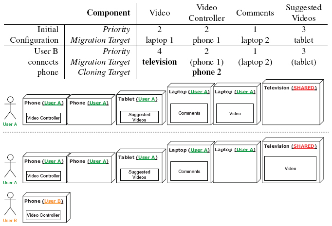
Figure 10 When a second user connects to the application the video component is migrated to the shared device and a new instance of the video controller is deployed on the new user’s phone.
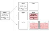
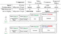
5.2 Scenario 2: Dynamic Device Role Change
In Figure 11 we show an example of dynamic change in the metadata configuration of the connected devices. The initial device configuration is not accepted by at least one liquid media query defined in the video controller component, and the target device for the video and comments components points the same laptop. Starting from the highest priority, the suggested video component is deployed on the tablet and the video component is deployed on the laptop. Since the laptop component is already the target of the video component, the comments component migrates to the television, which was ranked as the next possible target for migration. The video controller component is deployed on the tablet device with the lowest priority.
When UserA assigns the role display to the television, the device metadata changes. The user interface is redistributed and the video component migrates to the television, because the liquid-style that defines the property device-role is now accepted by the device with an higher priority. The comment component migrates to the now available laptop device.
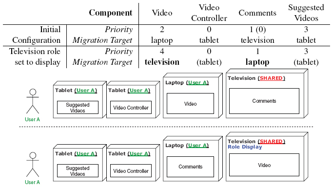
Figure 11 After the television device changes role configuration, the video and comments components are swapped following different priorities.
6 Discussion
In this section we discuss the impact of the liquid media queries on the design of liquid Web applications. Throughout this paper we designed the multi-device adaptation targeting the needs of the developers, whose goal is to create software that can take advantage of multiple devices with the goal of increasing the overall usability of the application. Ultimately, however, the effect of the liquid media queries will be experienced by the user that interacts with the liquid Web application.
6.1 Developers
The multi-device adaptation introduces a new level of complexity that the developers have to face during the design process of their applications. When the developers decide to shift from a single device deployment to a multi-device one, they do not only have to deal with the responsive design of the application, but they are also required to determine how and when components must be migrated across different set of devices. The decision of performing a migration can be driven by technological constraints (e.g. a component requires a sensor that only found on some devices), and/or driven by social interactions [15] and context [27]. Taking into consideration these aspects can be difficult for the developers, and in some cases it can be hard to predict the impact of their multi-device adaptation on all possible sets of users devices. In fact the number of possible combinations of devices owned by the users can grow very fast.
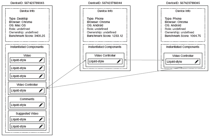
Figure 12 Liquid media query debugger tool view.
Since so many new facets need to be taken into consideration during the design process, developers would greatly benefit from testing and debugging tools, helping to simulate the deployment and observe the behavior of liquid Web applications in a virtual multi-device environment.
In Figure 12 we show a view of our debugger tool for liquid styles. By using the tool the developers can monitor at runtime the evolution of the deployment information stored in the shared state of the application. The debugger visualizes all information about the connected devices, their meta-information (e.g. identifiers, types, roles, ...), the instantiated components deployed on the devices and their instantiated liquid-styles. Moreover the tool shows which components are cloned across the devices by connecting two components with an arrow. Since the view is updated in realtime, any time the set of devices is affected by a new event, the view updates and displays the new deployment after the redistribution and cloning process finishes executing. Currently the developers can also read and directly edit the stylesheet encapsulated inside the liquid-style components.
In the future we plan to add the following features:
- Edit liquid media queries: The developers can edit the media queries at run time (e.g., change the value of a liquid media feature or type).
- Add or remove
liquid-stylesat runtime: Even if it is already possible to add or removeliquid-stylecomponents at runtime thanks to the design of theliquid-stylebehavior, the user interface of the debugger tool does not yet allow developers to create new styles on the fly. - Edit device metadata: The developers can alter the metadata associated to the connected devices (e.g., type, role). Currently the developers can alter the metadata only from within the corresponding device, however altering the data in the debugger tool is faster and will immediately give back a feedback to the developers about the overall state of the deployment.
- Add and remove virtual devices: The developers can create virtual devices and connect them to the application even if they do not physically own them. This feature would allow the developers to simulate deployments that otherwise they could not test.
6.2 Users
From the perspective of the users, the concerns are different. The users care about their own satisfaction and engagement while they use the displayed user interface, and generally they can disagree with the automatic adaptation rules set by developers. In our current approach, the developers are in full control of the liquid media queries and the algorithm does not consider the user needs and opinions when it computes the redistribution.
Still, we believe that the users should remain in control of the deployment of the application on their own devices, and that they should be able to override any decision taken by the algorithm at any time. This can be done in many forms:
- Edit liquid media queries: The users are allowed to directly edit the values of the liquid media features and types, however editing these values requires some knowledge of the media queries that the majority of the users do not necessarily have. The users may also add or remove constraint instead of just editing the values.
- Ask for permission when a new redistribution is computed: The users can prevent scheduled migrations as they need to give permission to the algorithm before applying the migration plan. Asking for permission would also prevent that components are migrated to devices the user does not own, hence enhancing privacy.
- Pin components: The users can decide that some components should never be migrated, because they are satisfied with the current deployment of a component on a particular device. In this case the users should be able to pin the components to the devices, and the algorithm should exclude those components from the redistribution process, unless the device instantiating the component disconnects.
- Switch from automatic to manual controls: The users can prevent any further recomputation of the redistribution and switch to manual controllers. This is already feasible in Liquid.js.
- Memorize usage patterns: The redistribution algorithm can learn from the users their favourite deployment patterns, e.g., if the users move a component multiple times to the same target device, the application in the future can automatically deploy the component to the corresponding device when it becomes available.
7 Conclusion
This paper describes a rule-based approach that can be used by developers to declaratively specify how the components within a liquid Web application can be dynamically deployed across multiple devices. The liquid media queries allow developers to define CSS style sheets for Web components in relation to the dynamic multi-device environment they are expected to be deployed on. We identify the main features defining the liquid execution environment: the number of connected devices, their types, the number of authenticated users, three specific types of device ownership, and the application-specific role played by a device. The liquid-style element we designed allows Liquid.js for Polymer to understand and to retrieve the information from within the liquid media queries. The execution of the algorithms we presented automatically and transparently compute the next deployment state of the application.
We decided to extend standard CSS3 media queries, instead of creating our own rule-based approach from scratch, because our main goals is to support developers as they start design complementary view adaptations by proposing similar technologies they already use for designing responsive Web UIs. Reusing and extending compatible Web standards can help developers to take a step towards building multi-device distributed user interfaces featuring complementary view adaptation, and towards liquid software in general.
8 Future Work
The algorithms in this paper are designed under the assumption that the number of devices running a liquid Web application is limited. While this is true for single user environments, in which the number of devices owned by one user is small (3 on average [11]), further work is needed to assess the scalability of the approach to deal with a large number of devices in a multiuser collaborative scenario where it may become impractical to declare liquid media queries matching all possible device combinations.
Another direction for future work concerns the use of logical operators such as not and only found in standard CSS media queries but which are not supported by the proposed encoding using attributes of the liquid-style element.
Acknowledgements
This work is supported by the SNF with the “Fundamentals of Parallel Programming for PaaS Clouds” project (Nr. 153560). The debugger tool was partially developed by Petr Knetl.
1https://drafts.csswg.org/mediaqueries-4
2https://polymer-library.polymer-project.org/3.0/docs/devguide/behaviors
References
[1] Anstead, E., Benford, S., Houghton, R. J.: Many-Screen Viewing: Evaluating an Olympics Companion Application. In: Proc. of the ACM International Conference on Interactive Experiences for TV and Online Video. pp. 103–110. ACM (2014)
[2] Atzori, L., Iera, A., Morabito, G.: The Internet of Things: A Survey. Computer Networks 54(15), 2787–2805 (2010)
[3] Brudy, F., Holz, C., Rädle, R. Wu, C., Houben, S., Klokmose, C., Marquardt, N.: Cross-Device Taxonomy: Survey, Opportunities and Challenges of Interactions Spanning Across Multiple Devices. In: Proceedings of the 2019 CHI Conference on Human Factors in Computing Systems. p. 562. ACM (2019)
[4] Elmqvist, N.: Distributed User Interfaces: State of the Art. In: Distributed User Interfaces, pp. 1–12. Springer (2011)
[5] Frain, B.: Responsive Web Design with HTML5 and CSS3. Packt Publishing (2012)
[6] Gallidabino, A., Pautasso, C.: Maturity Model for Liquid Web Architectures. In: Proc. of 17th International Conference on Web Engineering (ICWE2017). vol. 10360 LNCS, pp. 206–224. Springer, Rome, Italy (June 2017)
[7] Gallidabino, A., Pautasso, C.: The Liquid User Experience API. In: Companion of the The Web Conference 2018, Developers Track (TheWebConf2018). pp. 767–774 (2018)
[8] Gallidabino, A., Pautasso, C.: Multi-Device Adaptation with Liquid Media Queries. In: Proc. of the 19th International Conference on Web Engineering (ICWE2019). pp. 474–489. Springer, Korea (June 2019)
[9] Gallidabino, A., Pautasso, C.: The Liquid WebWorker API for Horizontal Offloading of Stateless Computations. Journal of Web Engineering 17(6), 405–448 (September 2018)
[10] Gallidabino, A., Pautasso, C., Mikkonen, T., Systa, K., Voutilainen, J.P., Taivalsaari, A.: Architecting Liquid Software. Journal of Web Engineering 16(5&6), 433–470 (September 2017)
[11] Global Connected Consumer Survey: The Connected Consumer. http://www.google.com.sg/publicdata/explore?ds=dg8d1eetcqsb1_ (2017)
[12] Husmann, M., Spiegel, M., Murolo, A., Norrie, M.C.: UI Testing Cross-Device Applications. In: Proc. of the 2016 ACM on Interactive Surfaces and Spaces (ISS2016). pp. 179–188. ACM (2016)
[13] Jokela, T., Ojala, J., Olsson, T.: A Diary Study on Combining Multiple Information Devices in Everyday Activities and Tasks. In: Proceedings of the 33rd Annual ACM Conference on Human Factors in Computing Systems (CHI2015). pp. 3903–3912. ACM (2015)
[14] Kadlec, T.: Implementing Responsive Design: Building Sites for an Anywhere, Everywhere Web. New Riders (2012)
[15] Kawsar, F., Brush, A.: Home Computing Unplugged: Why, Where and When People Use Different Connected Devices at Home. In: Proceedings of the 2013 ACM international joint conference on Pervasive and ubiquitous computing (UbiComp2013). pp. 627–636. ACM (2013)
[16] Levin, M.: Designing Multi-device Experiences: An Ecosystem Approach to User Experiences Across Devices. O’Reilly (2014)
[17] Luyten, K., Coninx, K.: Distributed User Interface Elements to Support Smart Interaction Spaces. In: Multimedia, Seventh IEEE International Symposium on. IEEE (2005)
[18] Marcotte, E.: Responsive Web Design. Editions Eyrolles (2011)
[19] Melchior, J., Grolaux, D., Vanderdonckt, J., Van Roy, P.: A Toolkit for Peer-to-Peer Distributed User Interfaces: Concepts, Implementation, and Applications. In: Proceedings of the 1st ACM SIGCHI symposium on Engineering interactive computing systems. pp. 69–78. ACM (2009)
[20] Mikkonen, T., Systä, K., Pautasso, C.: Towards Liquid Web Applications. In: Proc. of the 15th International Conference on Web Engineering (ICWE2015), pp. 134–143. Springer (2015)
[21] Mori, G., Paterno, F., Santoro, C.: Design and Development of Multidevice User Interfaces through Multiple Logical Descriptions. IEEE Transactions on Software Engineering 30(8), 507–520 (2004)
[22] Müller, J., Alt, F., Michelis, D., Schmidt, A.: Requirements and Design Space for Interactive Public Displays. In: Proc. of the 18th ACM international conference on Multimedia. pp. 1285–1294. ACM (2010)
[23] Nebeling, M., Mintsi, T., Husmann, M., Norrie, M.: Interactive Development of Cross-Device User Interfaces. In: Proc. of the 32nd annual ACM conference on Human factors in computing systems. pp. 2793–2802. ACM (2014)
[24] Nicolaescu, P., Jahns, K., Derntl, M., Klamma, R.: Yjs: A Framework for Near Real-Time P2P Shared Editing on Arbitrary Data Types. In: Proc. of the 15th International Conference on Web Engineering (ICWE2015). pp. 675–678. Springer (2015)
[25] Paternò, F., Santoro, C.: A Logical Framework for Multi-Device User Interfaces. In: Proceedings of the 4th ACM SIGCHI symposium on Engineering interactive computing systems. pp. 45–50. ACM (2012)
[26] O’reilly, T.: What is Web 2.0. O’Reilly Media, Inc. (2009)
[27] Oulasvirta, A., Sumari, L.: Mobile Kits and Laptop Trays: Managing Multiple Devices in Mobile Information Work. In: Proceedings of the SIGCHI conference on Human factors in computing systems. pp. 1127–1136. ACM (2007)
[28] Taivalsaari, A., Mikkonen, T., Systa, K.: Liquid Software Manifesto: The Era of Multiple Device Ownership and Its Implications for Software Architecture. In: 38th Computer Software and Applications Conference (COMPSAC2014). pp. 338–343 (2014)
[29] Zorrilla, M., Borch, N., Daoust, F., Erk, A., Flórez, J., Lafuente, A.: A Web-Based Distributed Architecture for Multi-Device Adaptation in Media Applications. Personal and Ubiquitous Computing 19(5–6), 803–820 (2015)
Biographies

Andrea Gallidabino. He is part of the Architecture, Design and Web Information Systems Engineering Group under the supervision of his advisor Prof. Cesare Pautasso. The group is part of the Software Institute at Univeristà della Svizzera Italiana. As a researcher in the group he focuses his work mainly on liquid software and real-time communication Web technologies. Moreover he helps the professor with lectures, interacting with students on a daily basis. His research interests are: Web technologies, real-time applications, liquid software, and multi-device interactions. You can find more information on http://www.inf.usi.ch/phd/gallidabino/ and follow him @AGallidabino.

Cesare Pautasso. He is a Full Professor at the Software Institute of the Faculty of Informatics, USI Lugano, Switzerland, and formerly researcher at the IBM Zurich Research Lab (2007) and senior researcher at ETH Zurich (2004–2007) where he completed his Ph.D. in 2004. At USI he leads the Architecture, Design and Web Information Systems Engineering research group. He is currently supervising the research of a group of Ph.D. students building experimental systems to explore the intersection of cloud computing, software architecture, Web engineering, and business process management, with ongoing projects exploring workflow benchmarking, RESTful conversations, and liquid software. He is the coauthor of the book SOA with REST (2012) and currently writing a book titled Just Send an Email: Anti-Patterns for Email-Centric Organizations (published on LeanPub). He is coeditor of the IEEE Software Insight department and program chair of the 20th International Conference on Web Engineering (ICWE2020). You can find more information on http://www.pautasso.info and follow him @pautasso@scholar.social.
Journal of Web Engineering, Vol. 18_8, 761–800.
doi: 10.13052/jwe1540-9589.1882
© 2020 River Publishers