LiveSankey: Advanced Web Visualization in Data Intelligence Multi Domain Contexts
José M. Conejero*, Juan Carlos Preciado, Alvaro E. Prieto, Roberto Rodriguez-Echeverria and Fernando Sánchez-Figueroa
Quercus Software Engineering Group. School of Technology, University of Extremadura, Spain
E-mail: chemacm@unex.es; jcpreciado@unex.es; aeprieto@unex.es; rre@unex.es; fernando@unex.es
* Corresponding Author
Received 24 November 2019; Accepted 14 April 2020; Publication 03 June 2020
Abstract
In the last years, the growing volumes and sources of data has made Big Data technologies to become mainstream. In that sense, techniques like Data Visualization are being used more and more to group large amounts of data in order to transform them into useful information. Nevertheless, these techniques are currently included in Business Intelligence approaches to provide companies and public organizations with helpful tools for making decisions based on evidences instead of intuition. The Sankey diagram is an example of those complex visualization tools allowing the user to graphically trace meaningful relationships in large volumes of data. However, this type of diagram is usually static so they must be continuously and manually rebuilt on top of massive multivariable environments whenever decision makers need to evaluate different options and they do not allow to establish conditions over the data shown. This paper presents LiveSankey, an approach to automatically generate dynamic Sankey Diagrams allowing users to filter the data shown. As a result, multiple conditions may be established over the data used and the corresponding diagram can be dynamically rebuilt.
Keywords: visualization, data intelligence,sankey, multi domain.
1 Introduction and Motivation
Throughout history there have been ages that have marked turning points in society. Currently we are faced with the beginning of one of these turning points, a new leap in evolution which arises thanks to the advantages of technology, but which has recently been revolutionising social concepts of governance, management and participation. In this new cycle of massive data, we generate huge amounts of data, which are not always used to help us in our everyday life or in making decisions, making evident the importance of treating these data in order to turn them into information that is useful and relevant for us. We are now in a new age, with the leading role of data intelligence in the time of Big Data [1, 2]. However, the volume of data generated each day is huge, coming from multiple sources and in diverse formats, usually designed with different goals, methods, profiles, and production and consumption paces. So, Big Data must solve several challenges, such as its inherent complexity in the different stages of data cycle: data capture, data storage, data analysis and data visualization.
The main challenge of data visualization in the Big Data domain is to deal with its large size and complexity dimension. As [3] state, Big Data systems “with a rich palette of visualizations, which can be quickly and declaratively created, become important in conveying to the users the results of the queries in ways that are better understood in the particular domain and are at the right level of detail”. In this scenario, Data Visualization [4] techniques were introduced to tackle this complexity by means of innovative and graphical approaches, enabling the visual simplification of all information processed from the collected data. In other words, Data Visualization is a really good option to simplify the complexity of understanding relationships among complex and massive data. Even, these techniques have become a mainstream in Data Analysis due to the importance of being able to visualize the information in a simple (information must be quickly understood by people who the information is provided for), agile (information must be processed and displayed in a reasonable time-frame) and powerful (all the potential information must be presented) way. This information visualization supports decision making and the advanced analysis of the collected data, by means of report and graphical techniques to represent knowledge in an interactive and intuitive way.
Sankey Diagram [5] is one of these advanced techniques to visualize complex relations of data. This diagram can be decomposed into flow graphical relations, in which width of lines related with different nodes are proportional to the value visually described (flow quantity to visually represent many to many relationships with respective proportions). However, in order to make Data Visualization systems valuable, the graphical information provided must be useful and relevant to be consumed by the decision maker. Note that, even although being the data the same for all the users, they may want to access the information in a different way, according to their needs and profiles. Thus, these visualizations should provide the feature to configure the information presented in a different way for each consumer. However, this feature has been traditionally neglected in tools for generating Sankey diagrams and they are usually static so that the information presented may not be dynamically filtered. This would enables a new interaction with this diagram that would improve traceability of data when several nodes are subsequently connected through different flows. As an example, when two flows arrive at a node, and this node is connected to a subsequent one, the user may not know the contribution of each flow that arrives at the intermediate one to the flow that departs from this node for the subsequent one. Obtaining that traceability would be helpful for decision makers, especially when they need to evaluate differents options on the spot to facilitate the recognition of hidden patterns and relationships in the same data, reconfiguring the values used, their characteristics or incorporating or eliminating dimensions. However, Sankey diagram generated by common tools are difficult to build / rebuild in massive multivariable environments so that the only solution to that context is to create a new diagram once and again. With this idea in mind, this work presents LiveSankey, an advanced visualization approach in data intelligence multi domain contexts that allows decision makers to explore and to compose / recompose interactively complex sequence scenarios represented as Sankey diagrams. Although there are other proposals that allow the generation of Sankey diagrams for multi domain contexts, they lack of the interactive features that are provided by LiveSankey.
The rest of the article is organized as follows. Section 2 reviews some works related with the generation of Sankey Diagrams. Section 3 details the architecture and describes the implementation of LiveSankey. Finally, section 4 presents an application case using LiveSankey whilst Section 5 concludes the paper.
2 Background and Related Work
In order to make the paper self-contained, this section firstly describes what a Sankey Diagram is. Then, a comparison among different tools to generate dynamic and interactive Sankey Diagrams is presented.
2.1 Sankey Diagrams
The Sankey diagram was conceived over 100 years ago by the engineer Riall Sankey to analyze the thermal efficiency of steam engines and has been traditionally applied to represent the energy and material balances of complex systems [6]. Nowadays Sankey diagrams are used for representing network data, traffic and transport data, product costing, workloads and bottlenecks, diseases domain, energy data, labor or educational flows, etc. In general, Sankey diagrams are suitable to depict tree data structures associated with value attributes incorporating visual information directly into these diagrams. It is structured by a graphic part and a sequence part. This kind of diagrams depicts information applying colours to flows and depending on the quantity it represents between nodes, it will have a certain width, colour and colour alpha. The nodes/dimensions are placed along the diagram in terms of time, cycles or stages, representing a static snapshot of composed dynamic situations.
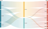
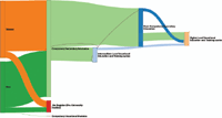
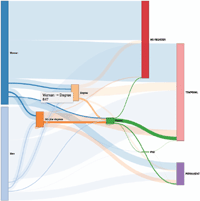
Figure 1 shows an example of Sankey Diagram (extracted from [7]) with three dimensions: sources, buckets and targets. Based on these three dimensions and the flow width, me may identify the contribution of each source to each bucket and what parts of each bucket are finally dedicated to each target.
2.2 Tools Comparison
Today, there are severals frameworks that allow the automatic generation of these diagrams in Business Intelligence field like Tableau, R, MicroStrategy, Google Visualization, ArmChart, among others. However, exploiting the dynamic aspect of the data on the spot still remains a challenge for these tools. Similarly, there are a lot of papers that describe how to use Sankey Diagrams to visually represent flows in severals domains, but less effort has been dedicated to give enhanced interactive and dynamic capabilities to manage these ones on the spot, so we mainly focus on prior work about interactive improvements.
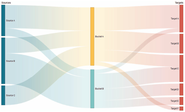
Figure 1 Sankey Diagram example extracted from [7].
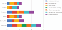
Regarding the interactive and dynamic improvements on Sankey Diagrams, LifeFlow [8] introduced a way to aggregate multiple event sequences into a tree, and Outflow [9] allows to include events into a graph as well as statistics. Outflow is conceived in medical domain like a visualization and analysis environment to understand patient progression over time. In Frequence [10], each subsequence is represented as an individual edge to provide an overview of all sequences and their individual outcomes and support, as we support user tasks to find meaningful individual sequences. Alluvial diagrams [11] are similar to Sankey ones. We have evaluated here the Alluvial generator [12]. Finally, SankeyMatic [13] is a free online tool that acts as a simple and easy web based Sankey diagram builder. With the aim of evaluating the capabilities of each approach we have identified the following features, according to the steps for evaluating software introduced in previous works such as [14] and quality models like the introduced in [15, 16]:
- (a) web-based interface: deployed via web browser. We consider this feature important due to the cloud-deployability options for other tools around it.
- (b) live data-driven: live load of data. This feature refers to the dynamic capability of changing the data used for generating the sankey diagram.
- (c) multi domain: can be applied to several domains. It refers to the option of being used with different datasets.
- (d) live dimensions ordering: allows to re-order the dimension over the generated diagram. By this characteristic, the nodes of the graph may be reordered so that different diagrams with the same data may be generated.
- (e) filtering subsequences: by means of this characteristic, the user may filter by a condition and the rest of the diagram may be dynamically adapted in terms of that condition.
- (f) navigation by level-of-detail: it is also related to the previous characteristic since filtering the data, the user may obtain more detailed information from the visualization (e.g. number of persons that meet a condition).
- (g) customize diagram: this option refers to the approach capability of dynamically changing the aspect of the generated diagram.
In order to collect the capabilities of the approaches identified in this related work section for covering the six features, we have fixed a simple comparison process based on a three level degrees process. Each degree represents the particular approach capability to design the objectives shown in Table 1. Suitability of each comparison goal is represented by one of the following Coverage Degrees:
- High Coverage Degree (
H ), which represents that the feature is covered by the approach, - Partial Coverage Degree (
P ), which is used when the feature is moderately covered, - None Coverage Degree (
N ) is used when the feature is not suitably covered.
Each Coverage Degree has a specific weight. In this evaluation the proposed weights are:
Due to the results shown in Table 1, the most suited approaches to design advanced visualization in data intelligence multi domain contexts using Sankey diagrams are Frequence and LiveSankey. Figure 2 also depicts that the feature tagged as d) live dimensions ordering is only available in LiveSankey, which is a novel contribution to prior approaches.
Table 1 Coverage degree reached for each feature evaluated
| a | b | c | d | e | f | g | |
| LifeFlow | |||||||
| OutFlow | |||||||
| Frequence | |||||||
| Alluvial | |||||||
| SankeyMatic | |||||||
| LiveSankey |
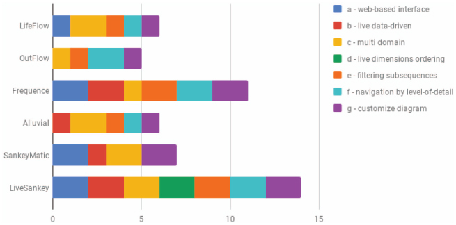
Figure 2 Results about the comparison process for covering the features.
3 Livesankey Architecture and Implementation
This section presents the architecture used to develop LiveSankey and the implementations details derived from that architecture that allowed us to cover all the features presented in previous section.
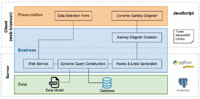
3.1 Architecture
LiveSankey follows a multi-layer architecture for web applications (web-based interface feature (a)) with a clear separation between the data; the logic for generating the diagrams, that is located into the server; and the user interaction, a client responsibility. Figure 3 shows a representation of this architecture where the different components involved in the webapp are presented. As it may be observed in this figure, the main technologies used for the implementation of the tool are JavaScript for the client tier, Python for the server side implementation, PostgreSQL as the database and NetworkD31 as the library for generating the diagrams. NetworkD3 is a library that connects R framework with D3, an Open Source JavaScript library that supports data manipulation and visualizations. So, based on NetworkD3 we may use R functionalities in a JavaScript domain. This library has been modified to enable the features that LiveSankey provides (these modifications are explained in Section 3.2.1). Among these features, LiveSankey provides an innovative functionality that allows switching on/off some flows in the diagram, so that the user may focus only on the parts that she is interested on. This functionality enables the regarding filtering subsequences (e) or navigation by level of detail (f) features. Moreover, since the generated diagrams are interactive, the feature live dimensions ordering (d) is also provided.
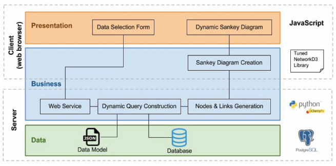
Figure 3 Tool architecture.
Based on that architecture, the behaviour and components that are involved in each layer are explained as follows:
- Presentation layer:
- – The “Data Selection Form” component is developed with JavaScript and hosted in the client (web browser). It allows the user to select the data dimensions that will be represented in the Sankey diagram. These dimensions are loaded based on the “Data Model” json file where the data used for generating the Sankey diagram must be described (so that the tool may be used with different datasets). This component also sends the (user) data selection to the server.
- – The “Dynamic Sankey diagram” component developed with JavaScript and hosted in the client (web browser) receives the Sankey diagram from the “Sankey diagram creation” component and allows users to dynamically interact with it.
- Business layer:
- – The “Web Service” element is an endpoint that is invoked by the “Data Selection Form” component. This web service receives the data from the client request. This web service is hosted in a web server developed by using the CherryPy Python library.
- – The “Dynamic query construction” component developed with Python is hosted in the server. It receives the data from the web service component and composes the queries to be executed against the database. These queries will provide the information that is needed to build the diagram (number of instances for each flow edge of the diagram).
- – The “Nodes & Link generation” component developed with Python is hosted in the server. It receives the result from the query executed against the database, transforms the data to the format required by NetworkD3 library and sends them to the “Sankey diagram creation” component.
- – The “Sankey diagram creation” component is developed with a modified version of NetworkD3 and hosted in the client (web browser). It receives the data from the “Nodes & Link generation” component and generates the diagram that is dynamically managed later by the “Dynamic Sankey diagram” component.
- The Data layer is based on the following assumptions:
- – The “Data model” json file contains a description of the database structure. This file is key for being able to apply the tool to different domains with, obviously, different datasets. This file is located in the server and will be deeper described in Section 3.2.2.
- – Data is stored into a PostgreSQL database also hosted in the server although, obviously, the usage of other databases would be feasible.
3.2 Implementation
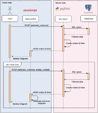
Based on the architecture previously described and the different components involved in it, the process implemented to generate a live and interactive diagram is illustrated in Figure 4.
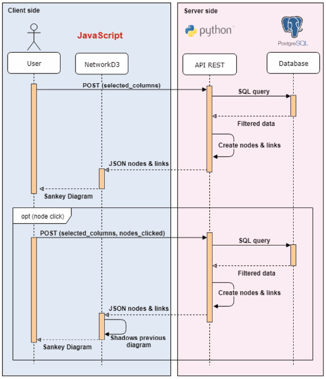
Figure 4 Process for generating a dynamic Sankey Diagram.
The process is started by the user by selecting the data that will be shown in the diagram. Note that the data selected by the user represent levels of the different data dimensions, that usually correspond to the columns (or group of columns) from the tables stored in the database that contains all the information that we want to represent in the diagram. This information is presented to the user by the “Data Selection form” component whilst the data dimensions are obtained from the “Data model” json file (explained in Section 3.2.2).
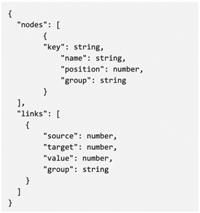
Once the user has selected the columns to be shown in the diagram, this information is sent to the server as an HTTP POST request (received by the “Web Service” component). Then, the process to obtain the data to be represented in the diagram starts in the server. The server creates a query (by the “Dynamic query construction” component), based on the set of columns to be represented, that is executed to obtain filtered data. To easily manipulate the response, a data dictionary is created. Based on this dictionary, the server builds a matrix (“Nodes & Link generation” component) with all the nodes (selected columns) and links (edges or flows between the nodes) that will be replied to the client. For each node, a pair of values is created, “group” and “name”, that represent the group that the column belongs to (if there exists) and the name of the column, respectively. Groups are used just for being able to select a set of columns in the client instead of selecting each one. For each edge, the information stored includes “source”, “target”, “group” and “value”. While source represents the node where the edge departs from, target is used to represent the node that it arrives to. Group is also used for handling a set of links as a unique entity. Finally, value represents the number of registries in the database that match the edge’s source and target. In other words, this value will be related to the width of the edge in the diagram.
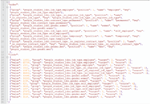
The matrix built by the server is sent to the client as a JSON file. Figure 5 shows the format of this file whilst Figure 6 shows a snapshot of a server response.
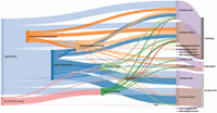
Based on the JSON file obtained from the server, the client builds (“Sankey diagram creation” component, built by the modified version of NetworkD3) and presents to the user the Sankey diagram (“Dynamic Sankey diagram” component). Figure 7 shows an example of a Sankey diagram generated for an application case in the education and employment environment where academic trajectories are represented together with labor information.
Finally, once the Sankey Diagram is presented to the user, she may interact with it to dynamically filter some of the data (functionality provided by the “Dynamic Sankey diagram” component). Based on this interaction, the user may see data traceability across more than two levels, that is one of the key features provided by LiveSankey. This feature allows to better understand the contribution of a flow to a particular node. To implement this feature, when user clicks on a node (e.g. “University Degree”), the client sends a new request to the server with the columns (data) to be shown in the diagram so that the process shown in the upper part of Figure 4 is repeated to build a new diagram (lower part of figure). However, in this case, in addition to these columns, the client sends the clicked node so that the server rebuild a new query to obtain the data from the database but adding a new condition based on the clicked node. Then, all the data obtained by the server must keep a relation with the clicked node (having a “University Degree”). The new data provided by the server is sent again to the client that shadows the previous diagram and shows a new layer with the new data. Based on this layers composition, the user may obtain the wished visualization. This functionality will be better understood in Section 4, where the aforementioned application case is deeply illustrated.

Figure 5 JSON response sent by the server.
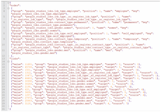
Figure 6 Example of server response.
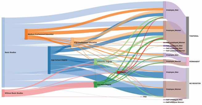
Figure 7 Example of a generated Sankey diagram.
3.2.1 NetworkD3 modifications
As it has already been mentioned, NetworkD3 is a library that connects R framework with a JavaScript library that supports data visualizations. Based on this library, Sankey diagrams may be generated and visualized into a web-based context. However, this library does not support some of the features described in Section 2.2 so that we modified the library (note that it is Open Source) to enable those features. The changes implemented are the next:
- Filters: It allows users to highlight a node and the links related to it as well as decrease the intensity of the colours of the rest of the nodes of the same data level (and their links). Concretely, this functionality is based on drawing two overlapped Sankey diagrams (instead of the original version that only draws one). So, when a user double clicks on a node, a new HTTP.POST request is sent to the server with the information of such node. Then, when the browser receives the response containing the nodes and links affected by the filter, it draws a new diagram over the original diagram, keeping both of them but with the colors of the original showing less opacity to produce the filter effect. The overlapped nodes are located in a way that only one can be seen. If the user moves vertically a node, the coordinates are replicated in the mirror node which is moved according to them, keeping the effect that simulates that there is only one node.
- Zoom: This functionality enable users to zoom in to or out of the Sankey diagram, being particularly useful when the Sankey diagram is composed of numerous levels with several values belonging to each one. To do this, the “wheel” event is captured to avoid the interference of the “double-click” and the “click”event. In case of moving forwards the mouse wheel (zoom in), this functionality takes the original position and stores the transformation of the diagram in a “zoomstate” variable. In case of moving backwards the mouse wheel (zoom out), the functionality ignores the coordinates of the event and also stores the transformation of the diagram in the “zoomstate” variable. In both cases the “zoomstate” variable is checked to be sure that the diagram is not out of the limits.
- Drag & Drop: Based on this modification, users may move the whole diagram when the zoom in functionality is being applied. To this purpose, the event “mousedown” is captured and, to avoid the interference with the “click” event, it waits until the “mousemove” event is launched. Then, the coordinates of the event are used to compute the transformation of the diagram and this transformation is stored in the “zoomstate” variable. Limits of the diagram: the previous modifications also includes some restrictions in order to protect the diagram from unwanted interactions:
- – Both Zoom and Drag & Drop do not allow that the diagram is moved away from the center of the screen more than eighty percent of the initial size. This avoids that the focus of the diagram is lost on the screen.
- – The maximum level of zoom in is restricted to 3 times.
3.2.2 Data Input
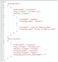
LiveSankey defines the data levels that may be used in the application based on a configuration file. This file is called data_model.json and is read by the server during the application startup. Note that thanks to this file, LiveSankey tool is generic so that it is able to generate the diagram independently of the input data. So, a well-formed data_model.json file is key to ensure that LiveSankey works properly. Obviously, the generation of this file depends on the particular application case so that its generation is out of the scope of this paper. However, this section explains the structure that this file should follow based on a simple example (a database storing a group of students and the educational certifications they have obtained). This example will be also used in next section to illustrate LiveSankey applicability. Assuming that our database stores the two aforementioned tables, called students and studies (see Tables 2 and 3), the data_model.json file to define these data levels is shown in Figure 8.
Table 2 Students table in the database
| student_id | gender | city_of_family_home |
| 1 | Male | New York |
| 2 | Female | Baltimore |
Table 3 Studies table in the database
| student_id | study | end_study_year |
| 2 | Compulsory Secondary Education | 2015 |
| 2 | Post-Compulsory Secondary Education | 2017 |
It can be seen that the file is divided into two main items, monovalued and multivalued. They are two arrays that contain a set of objects that represent tables from a database and their main difference is the type of table they represent:
- monovalued: the tables represented by this array should meet the requirement that each row belongs only to a unique instance. So, students table would be an element of this array in our example (students will be unique in this table).
- multivalued: in the tables represented by this array, the same instance could appear in several rows. So, certifications table would be an element of this array in our example since the same student may have more than one study or certification. Usually this kind of tables include a year column that will be later used to represent the temporal (chronology) relation in the Sankey diagram. In our example, the student 2 completed Post-Compulsory Secondary Education after Compulsory Secondary Education so that this instance will be computed in the flow that will connect the node representing the first certification (Post-Compulsory) with the second one (Compulsory).
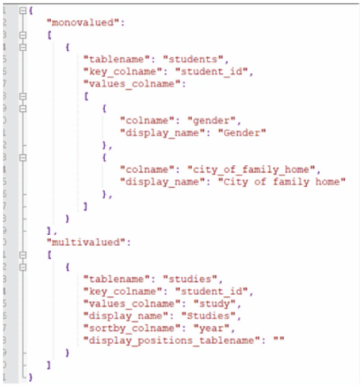
Figure 8 Data_model.json structure for the database represented in Tables 2 and 3.
Both, monovalued and multivalued attributes, share some attributes:
- tablename: name of the table. So, “student” and “studies” would be the possible values in our example.
- key_colname: name of the column that contains the identifier of the instances in the table specified in “tablename”. So, “student_id” would be the value in our example.
The next attributes are exclusive to monovalued:
- values_colname: it is an array of objects where each one represents a different column of the table. Each object is composed of:
- – colname: name of the column in the table. So, one possible value would be “city_of_family_home” in our example.
- – display_name: name to display in the diagram for that column. So, one possible value would be “City of family home” in our example.
Finally, these are the attributes exclusive to multivalued:
- values_colname: name of the column in the table. So, “study” would be the value in our example.
- display_name: name to display in the diagram for that column. So, “Studies” would be the text shown in the Sankey Diagram in our example.
- sortby_colname: it is an optional attribute. It may contain the name of the column to sort the rows by (if there could be multiple instances). In our example, if a student has two different studies, they are sorted by “year” so that the earlier study is represented before the later one.
- display_positions_tablename: it is an optional attribute. It may contain the name of the table in the database where it is specified in which position of the Sankey diagram the different values of the column indicated in “values_colnames” should be represented. This field is explained in next section so that it will be better understood.
3.2.3 Sorting nodes of the same dimension
There are some cases where we may be interested in placing the different nodes generated for the same column in a particular position. As an example, the column studies of Table 3 may present different values that will be later represented as different nodes in the sankey diagram. However, since these values are all stored in the same column (or dimension), they will be all presented vertically in the same line (as it is shown in Figure 9).
However, in this case, since there are some studies or degrees that are usually obtained after other ones, we could establish a particular order between the nodes of the same dimension so that they are vertically placed at different levels. To offer this functionality, LiveSankey uses the display_positions_table optional attribute explained in previous section that just contains the name of a table where this order may be defined. For instance, Table 4 shows a concrete order for the data contained in the studies column of our example.
Based on the order established in Table 4, the nodes of that dimension are placed in a different vertical level, as it may be observed in Figure 10.
4 Application Case
In order to better understand the utilization of the tool, this section shows a running example where it has been used to generate dynamic and interactive Sankey diagrams. This example is framed within a bigger project where the development of LiveSankey is integrated with the aim of designing a Data Engineering process to support the definition of precise policies, in education and employment areas, and decision making based on evidence. The project takes advantage of the opportunities that existing techniques (machine learning, predictive analytics, data visualization) offer to generate knowledge from large volumes of information. The project is focused on the region of Extremadura, in Spain, since an important anonymized dataset of 122.278 tuples is available and provided by the Educational and Employment Board of the public government of the region. Concretely, all the activities of citizens’ educational period and working life are recorded into data and available for being used within the project. Based on these data, and due to Sankey diagrams are useful for understanding complex datasets, LiveSankey has been used to represent the academic-employment trajectories of the data set so that public administration may use a high level dashboard where these trajectories are represented.
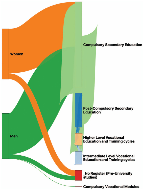
Figure 9 Sankey Diagram without sorting the nodes of the same dimension.
Table 4 Table specifying the sorting order for studies dimension
| field_value | field_position |
| _No Register (Pre-University studies) | 0 |
| Higher Studies in Drama Arts | 3 |
| Intermediate Studies in Art and Design | 1 |
| Higher Studies in Art and Design | 0 |
| Post-Compulsory Secondary Education | 3 |
| Compulsory Secondary Education | 1 |
| Intermediate Studies in Sport | 0 |
| Higher Studies in Design | 3 |
| Compulsory Vocational Modules | 1 |
| Intermediate Level Vocational Education and Training cycles | 0 |
| Higher Level Vocational Education and Training cycles | 3 |
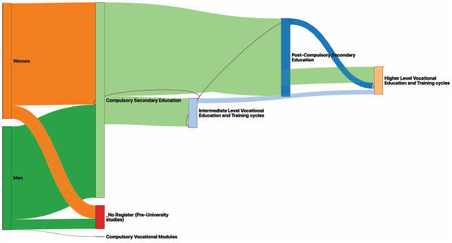
Figure 10 Sankey Diagram of Figure 9 with a particular order for studies dimension.
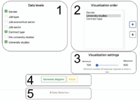
The source of data that is available for generating the Sankey diagrams has been divided into different levels that will be represented in the diagram. Thus, the user may select what level must be displayed in the diagram and these levels will be transformed into its nodes. Note that these levels provide from the Data_model.json file explained in previous section. In our example, firstly, the user may select the gender so that the sankey diagram will add a level distinguishing between male and female citizens. Secondly, regarding the employment levels, the user may include in the diagram information related to the citizen’s job type (employed or self-employed), the job economical sector (e.g. services, industry, agricultural and farming, etc.), the job sector (e.g. education, real estate, research, . . . ) and the contract type (temporal, full time employed or unemployed). Finally, regarding academic information, the levels that the user may select include pre-university degrees and university degrees. These levels are shown in part 1 of Figure 11 that shows a snapshot of the web page where the user may select this information.
Once the user has selected the levels to be included into the diagram, the visualization order may be selected so that the nodes corresponding to these levels will be shown in the selected order within the diagram. This step may be selected in part 2 of Figure 11.
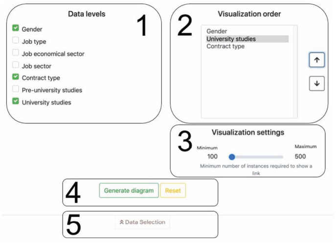
Figure 11 Selection of input data for the diagram.
The “Visualization settings” widget (part 3 of Figure 11) allows changing the granularity of the diagram by indicating the minimum number of instances with the same value required to show a link. It should be noted that a node will not be shown if it has neither an input link nor an output link. Thus, the higher this value, the lower the granularity of the diagram. As an example, if there is a node whose input and output links contain less than 100 citizens (there are less than 100 citizens that fulfil the condition represented by the node), it will not appear in the diagram. This is done for the sake of clarity.
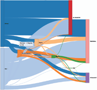
Finally, the user may generate the corresponding diagram (part 4 of Figure 11). Figure 12 shows the diagram that was generated for the data selected in Figure 11.
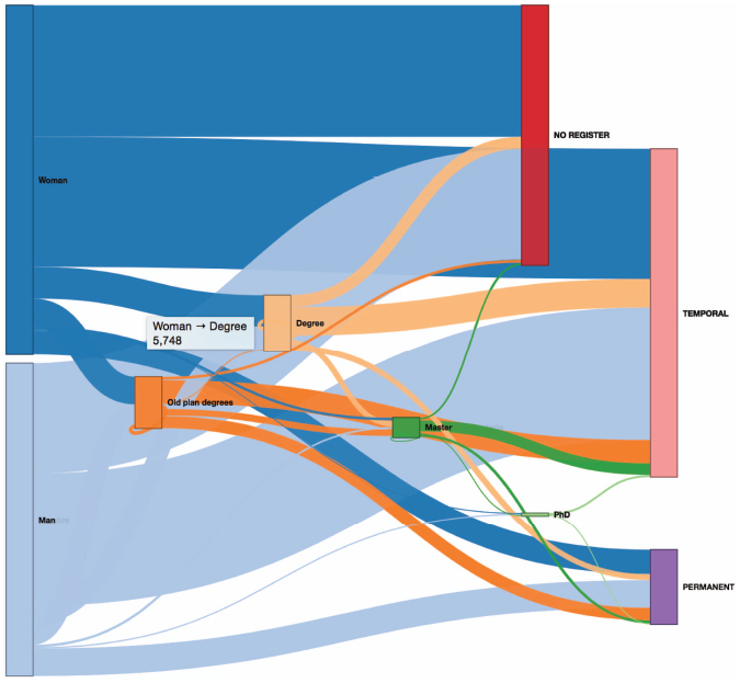
Figure 12 Sankey diagram generated for the input shown in Figure 11.
Note that, obviously, when the data selected as a level may have several possible values, they are represented as different nodes in the diagram. As an example, the value “Contract type” selected in the previous step may have three possible values: “NO REGISTER”, “TEMPORAL” or “PERMANENT”. These values represent the situation of being unemployed, having a temporal job or having a permanent job, respectively. Notice also that the user may obtain dynamic information as tooltips just moving the mouse over the different flows. As an example, in Figure 12, the tooltip is showing the amount of women that have obtain a university degree in the region according to the data (5748).
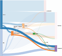
Now, the user could select a different set of data for the input (by using the option shown in part 5 of Figure 11) and the diagram could be automatically and dynamically reloaded showing the new information. However, although this is an important contribution, the feature that makes LiveSankey more interesting is the ability for filtering the data across more than two levels. In other words, we can select a node and the flows will be reloaded showing the data that are related to that node. In order to better explain this concept, Figure 13 shows an example. This figure shows the same diagram after selecting “PERMANENT” node.
The diagram has been dynamically filtered so that all the flows are shadowed but only the amount of data of each one that is related to the selected node (“PERMANENT”) are highlighted. As an example, notice that the flow that departs from the node “Woman” to “Degree” has now a shaded part and a highlighted one (in the middle) that visually shows the proportion of women that have a Degree and a permanent contract as well (only 614 of the 5748 aforementioned).
As a different example, Figure 14 shows the same diagram where, in this case, the “Master” node has been selected. We may graphically observe, for instance, that the set of women that study a Master are just a small proportion of those that study a Degree (647 of 5748).
Even, the user may select more than one node so that the filters may be combined showing the data that fulfill several conditions. Thus, based on these filters, the user may completely adapt the Sankey Diagram to show the wished data.
5 Threats to validity
In this section, we elaborate on several factors that may jeopardize the validity of our results, according to the well-known categorization introduced by [17].
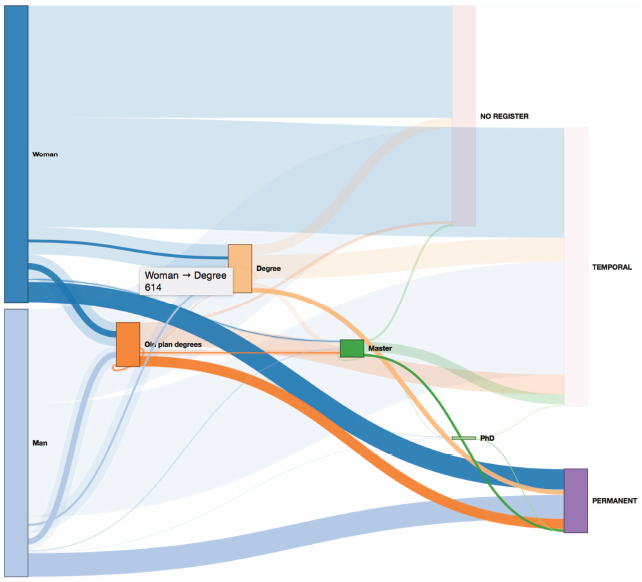
Figure 13 Sankey diagram filtered by selecting the node “permanent”.
Internal validity refers to the relationship between the treatment for an experiment and the outcomes obtained—in other words, whether we are sure that treatment we used in an experiment is really related to the actual outcome we observed. Since LiveSankey diagrams are built based on real data, we just checked, by querying the original sources, that the results obtained by the tool were consisted with the real data. Thus, this threat to validity was ruled out.
External validity refers to the possibility of generalizing the results outside the scope of the study. A potential external threat for our work would be the applicability of the tool to different datasets and domains. However, as it has been explained in Section 3, the tool has been designed for allowing the utilization of different datasets just by introducing a configuration file where different parameters must be specified.
Conclusion validity is concerned with the relationship between the treatment and the outcome. In that sense, in our example, the main conclusion threat regards to the interpretation of the results obtained by LiveSankey diagrams. Note that the diagram provides the data and its visual representation, however, the real interpretation of these data must be carried out by the domain’s experts. To avoid this threat, we collaborated in our application case with the members of the Educational and Employment Board of the region that interpreted the data obtained from a social perspective.
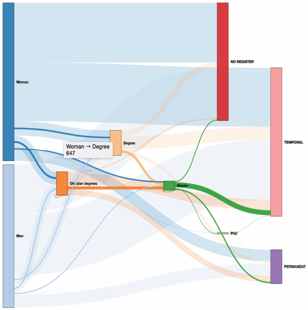
Figure 14 Sankey diagram filtered by selecting the “Master” node.
6 Conclusions
We have introduced LiveSankey, an innovative tool to generate dynamic Sankey diagrams that may be filtered so that with the same diagram we may obtain more than one representation. We introduced the main features that these tools usually provide and made a thorough comparison between ours and others existing in the literature/market. We also described how our tool is structured and implemented and that it performs well for all the features mentioned. In that sense, although there are other tools that generate Sankey diagrams, to the best of our knowledge, the tool presented here provides some features that has been neglected in the literature/market before, such as the possibility of lively ordering the dimensions, applying filters over the diagram and adapting it to different conditions. Based on these features, LiveSankey allows building different diagrams with the same data since they may be dynamically filtered to focus on the data that the user is interested in, being this an important contribution with respect to previous work. Moreover, since the tool takes as input a dataset and some specifications, it may be used to generate diagrams related to different domains.
The application of the tool to a real example has been illustrated by a case study based on education and employment data. This case study is part of a bigger project where the implementation of LiveSankey is included. Additionally, it was driven by the Educational and Employment Board of the region where the tool was applied so that its validation was performed by the final users/stakeholders. As further work, on one hand, we are already working on applying the same idea to different advanced visualization techniques. On the other hand, due to the current version of LiveSankey is designed to work with homogeneous sources of data, we are planning to extend it to work with heterogeneous sources [18] [19].
Acknowledgements
This work has been developed with the support of (i) project RTI2018-098652-B-I00, financed by FEDER/Ministerio de Ciencia e Innovación-Agencia Estatal de Investigación- and (ii) projects financed by FEDER and Junta de Extremadura (IB16055, IB18034 and GR18112). We would also like to thank to Javier Sierra and Miguel Torres for their support in the tool development.
1https://christophergandrud.github.io/networkD3/
References
[1] A. Cuzzocrea, I. Y. Song and K.C. Davis. Analytics over large-scale multidimensional data: the big data revolution!. In Proceedings of the ACM 14th international workshop on Data Warehousing and OLAP (DOLAP’11), ACM, New York, NY, USA, 101–104, 2011.
[2] E. Moguel, J.C. Preciado, F. Sánchez-Figueroa, M.A. Preciado and J.Hernández. Multilayer big data architecture for remote sensing in Eolic parks. IEEE Journal of Selected Topics in Applied Earth Observations and Remote Sensing, 8(10):4714–4719, 2015.
[3] H.V. Jagadish, J. Gehrke, A. Labrinidis, Y. Papakonstantinou, J.M. Patel, R. Ramakrishnan and C. Shahabi. Big data and its technical challenges Communications of the ACM, 57(7):86–94, 2014.
[4] M. Khan and S.S. Khan. Data and information visualization methods, and interactive mechanisms: A survey. International Journal of Computer Applications, 34(1):1–14, 2011.
[5] P. Riehmann, M. Hanfler and B. Froehlich. Interactive sankey diagrams. In IEEE Symposium on Information Visualization (INFOVIS 2005), IEEE, Minneapolis, MN, USA, 233–240, 2005.
[6] M. Schmidt. The Sankey diagram in energy and material flow management: Part I: History. Journal of industrial ecology, 12(1):82–94, 2008.
[7] Digital Splash Media. Using Sankey Flow Diagrams to Show Distribution & Flow. Available online at: https://digitalsplashmedia.com/2016/08/using-sankey-flow-diagrams-to-show-distribution-flow/.
[8] K. Wongsuphasawat, J.A. Guerra Gómez, C. Plaisant, T. Wang, M. Taieb-Maimon and B. Shneiderman. LifeFlow: visualizing an overview of event sequences (video preview). In CHI ’11 Extended Abstracts on Human Factors in Computing Systems (CHI EA ’11), ACM, New York, NY, USA, 507–510, 2011.
[9] W. Widanagamaachchi, Y. Livnat, P.T. Bremer, S. Duvall abd V. Pascucci, V. (2018). Interactive Visualization and Exploration of Patient Progression in a Hospital Setting. In AMIA Annual Symposium proceedings (AMIA 2017), American Medical Informatics Association, Washington D.C., USA, 1773–1782, 2017.
[10] A. Perer and F. Wang. Frequence: interactive mining and visualization of temporal frequent event sequences. In Proceedings of the 19th international conference on Intelligent User Interfaces (IUI ’14), ACM, New York, NY, USA, 153–162, 2014.
[11] M. Rosvall and C.T. Bergstrom. Mapping Change in Large Networks. PLOS ONE, 5(1): e8694, 2010.
[12] D. Edler and M. Rosvall. MapEquation software package. The alluvial generator. Available online at: http://www.mapequation.org/apps/AlluvialGenerator.html.
[13] S. Bogart. SankeyMATIC. A Sankey diagram builder for everyone. Available online at: http://sankeymatic.com.
[14] A. Adewumi, S. Misra, N. Omoregbe, L. Fernandez. Framework for open-source software evaluation and selection. Journal of Software: Practice and Experience, 49:780–812, 2019.
[15] F.J. Domínguez-Mayo, M.J. Escalona, M. Mejías, M. Ross, G. Staples. A quality management based on the Quality Model life cycle. Computer Standards & Interfaces, 34(4):396–412, 2012.
[16] F.J. Domínguez-Mayo, M.J. Escalona, M. Mejías, M. Ross and G. Staples. Towards a Homogeneous Characterization of the Model-driven Web Development Methodologies. Journal of Web Engineering, 13(1 & 2):129–159, 2014.
[17] C. Wohlin, P. Runeson, M. Höst, M. C. Ohlsson, B. Regnell, and A. Wesslén, Experimentation in software engineering: an introduction. Norwell, MA, USA: Kluwer Academic Publishers, 2000
[18] J.G. Enríquez, F.J. Domínguez-Mayo, M.J. Escalona, M. Ross and G. Staples. Entity reconciliation in big data sources: A systematic mapping study. Expert Systems with Applications, 80:14–27, 2017.
[19] R. Blanco, J. G. Enríquez, F. J. Domínguez-Mayo, M. J. Escalona and J. Tuya. Early Integration Testing for Entity Reconciliation in the Context of Heterogeneous Data Sources. IEEE Transactions on Reliability, 67(2):538–536, 2018.
Biographies

José María Conejero received his PhD in Computer Science from Universidad de Extremadura in 2010. He is an Assistant Professor at Universidad de Extremadura. He is the author of more than 50 papers of journals and conference proceedings and has also participated in different journals and conferences as member of the program committee. His research areas include the Aspect-Oriented Software Development, Requirements Engineering, Model-Driven Development or Ambient Intelligence.

Juan Carlos Preciado is a professor and member of the Quercus Software Engineering Group in the Department of Computer Science at the University of Extremadura (UEX). He was vicerrector of this university several years. His research areas include Model-driven Development, Web and Data Engineering where he has published around 100 papers in the Software Engineering field. He received a PhD in computer science from UEX in 2008.

Alvaro E. Prieto is currently an Assistant Professor at the University of Extremadura and member of the Quercus Software Engineering Group. He received the B.Sc. and Ph.D. degrees in Computer Science from the University of Extremadura (Spain), in 2000 and 2013, respectively. He is involved in various research, development, and innovation projects and his research interests include ontologies, linked open data, data engineering and predictive analytics.

Roberto Rodriguez-Echeverria, PhD, is member of the Quercus Software Engineering Group and professor of Computer Languages and Systems at the University of Extremadura (Spain). His research areas include Software Engineering, Web Engineering, Model-driven Engineering, Legacy Software Modernization and End-User Development. He has published more than 50 scientific publications in journals and international conferences.

Fernando Sánchez-Figueroa is a Professor in the Department of Computer Science at UEX. His research focuses on web engineering, big data visualization and MDD. He holds a PhD in Computer Science from UEX and is co-author of more than 100 publications related to Software Engineering.
Journal of Web Engineering, Vol. 19_2, 109–138.
doi: 10.13052/jwe1540-9589.1921
© 2020 River Publishers